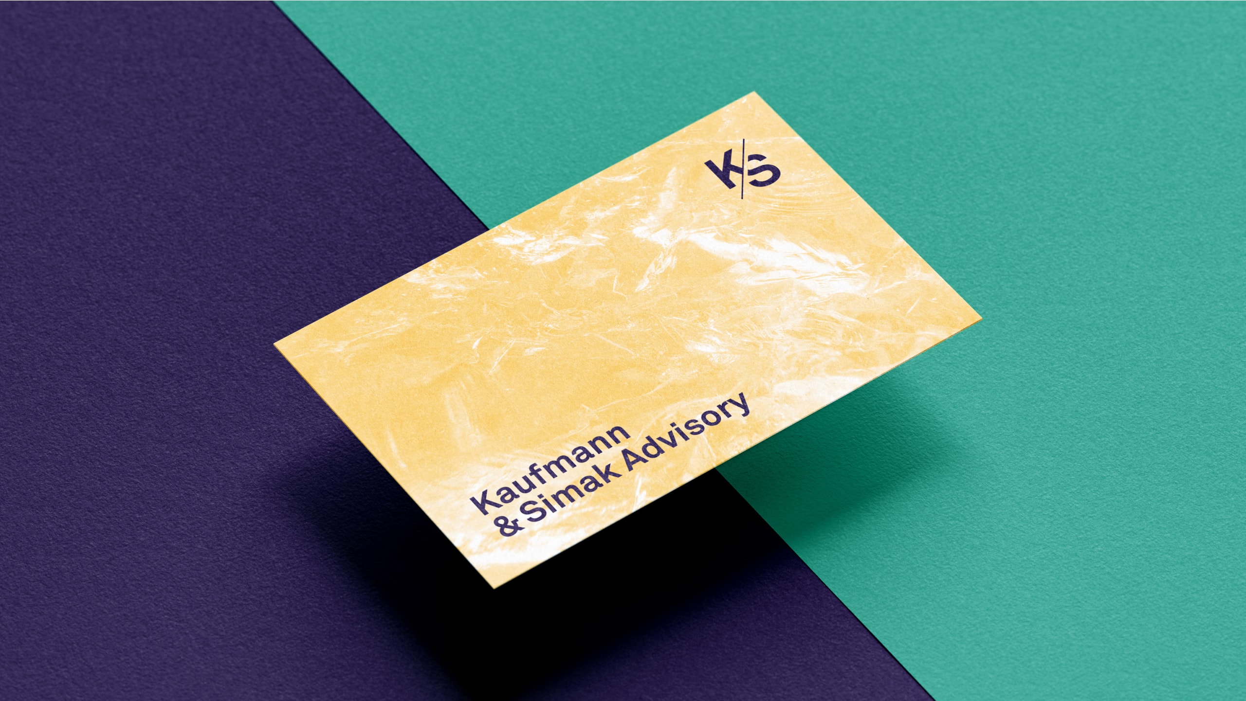
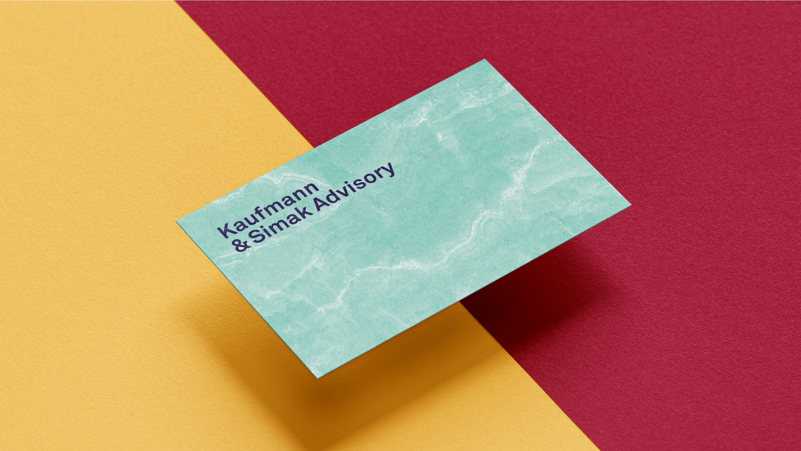
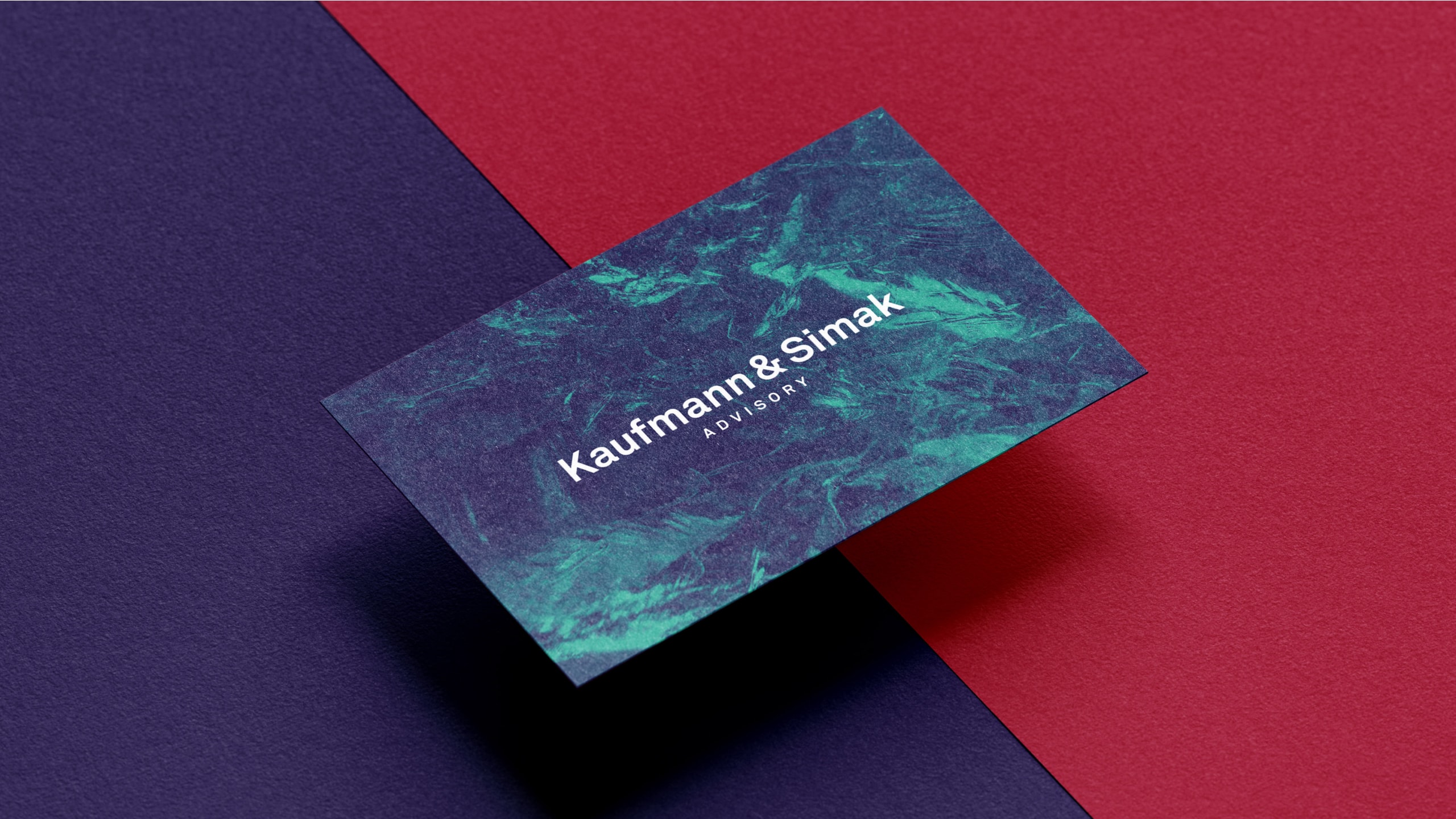
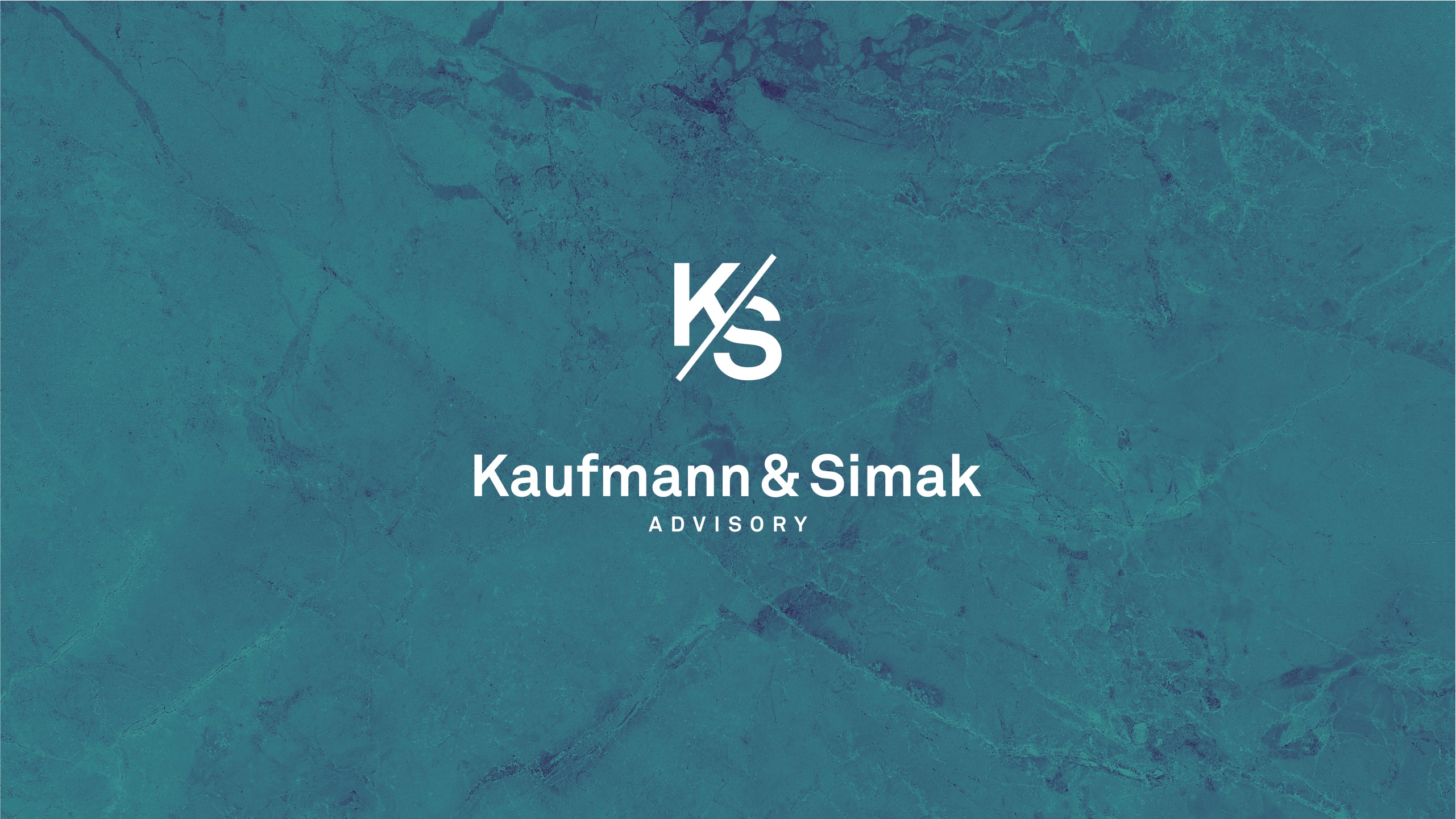
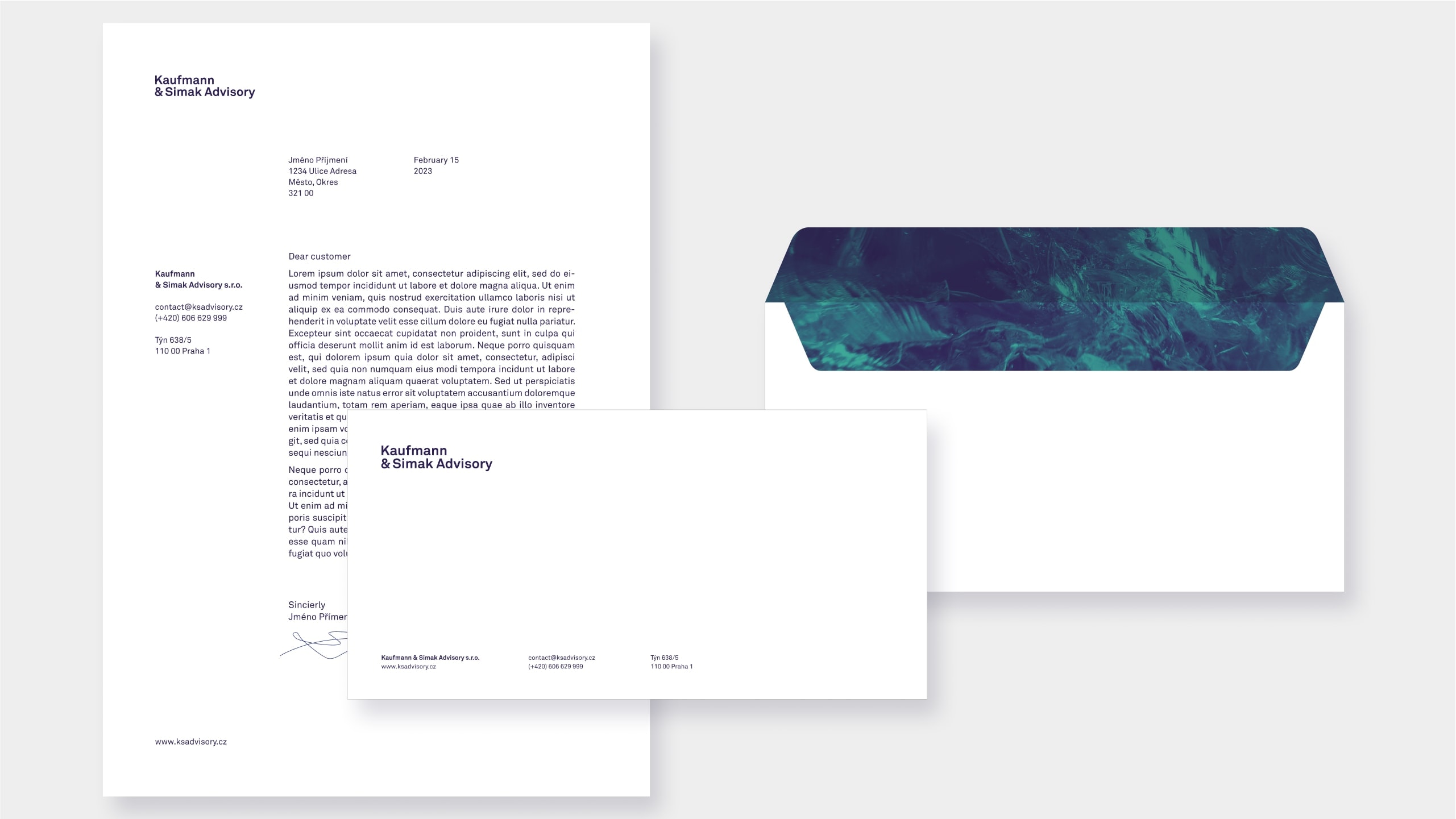
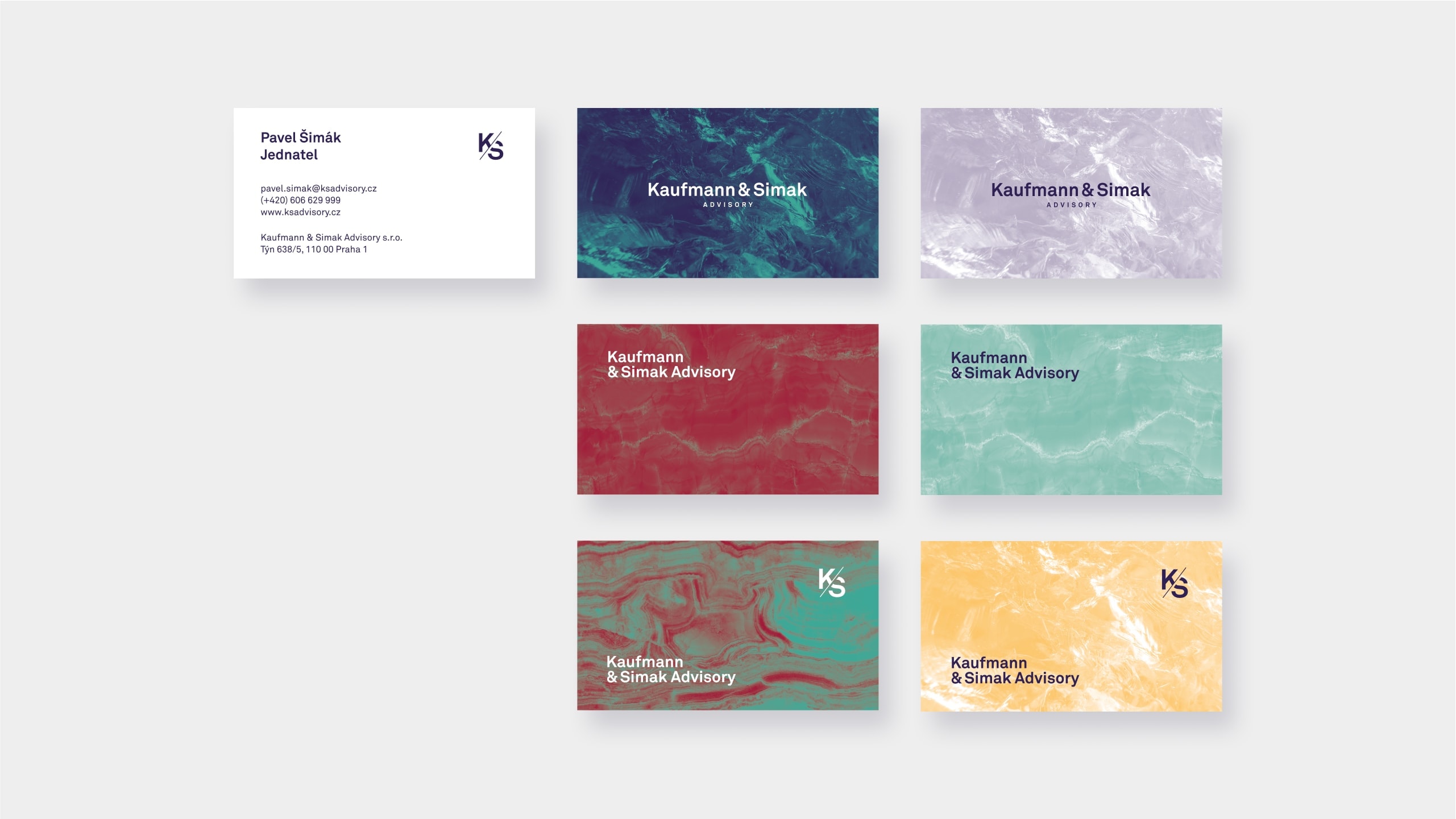
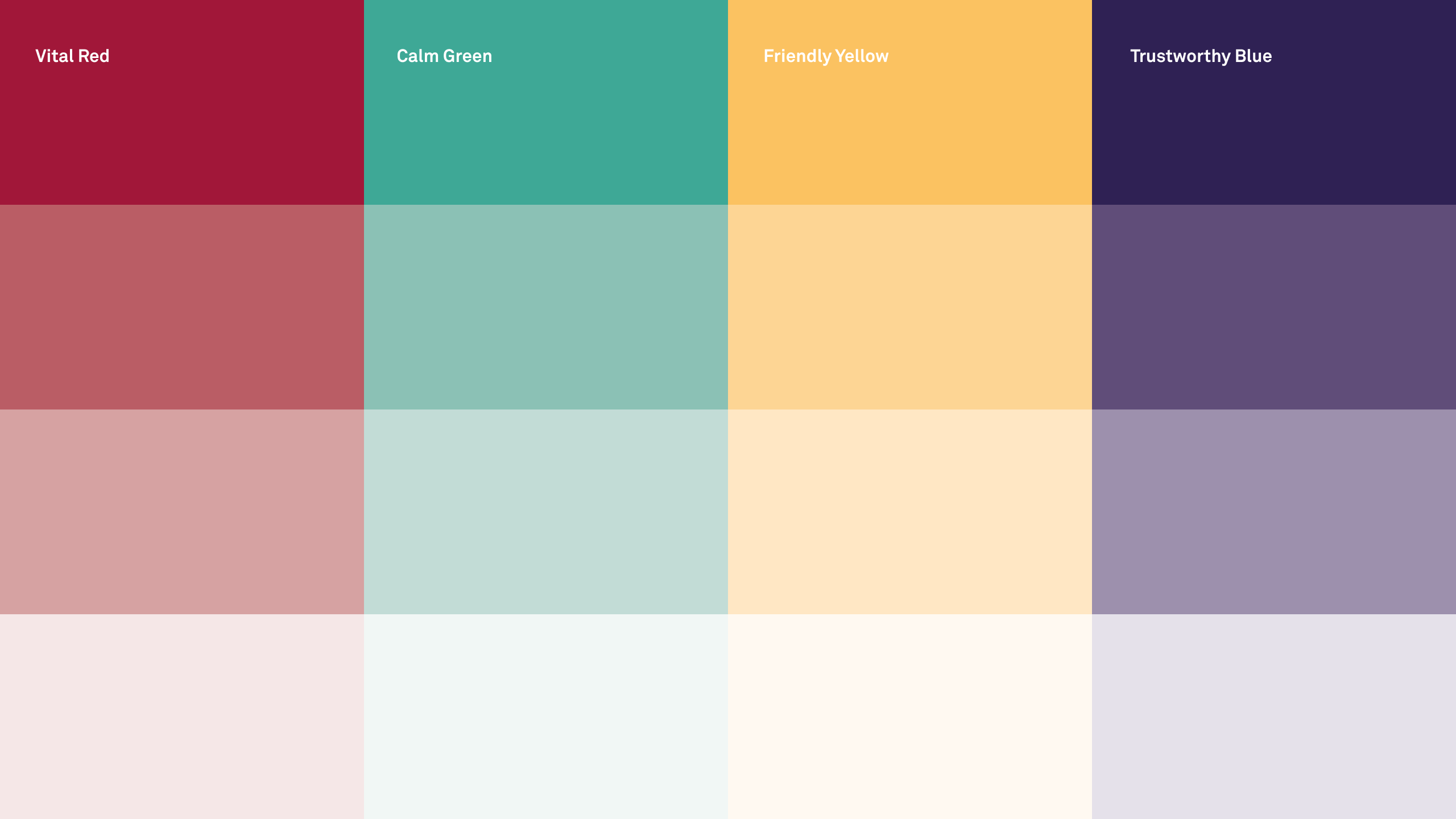
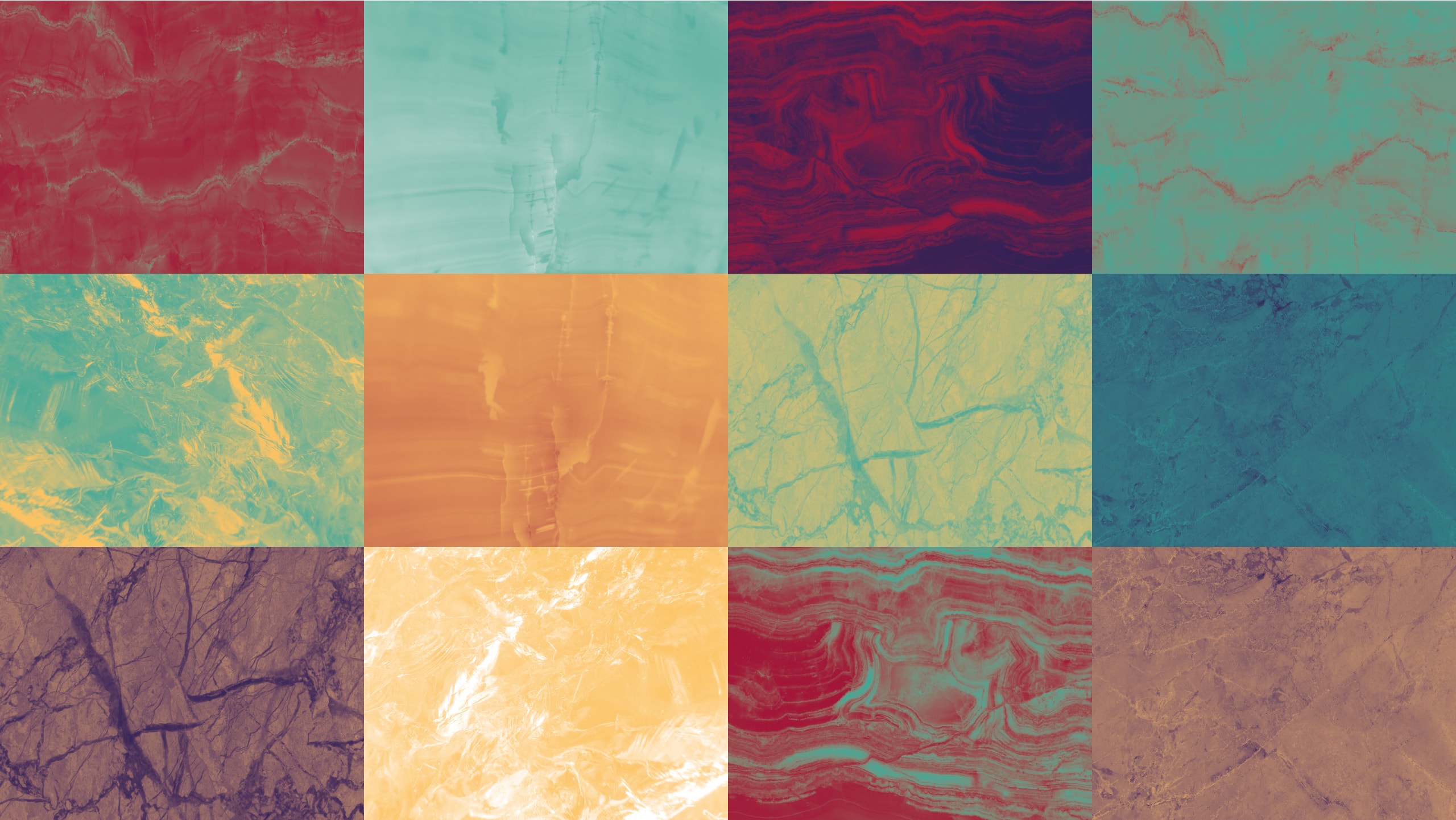
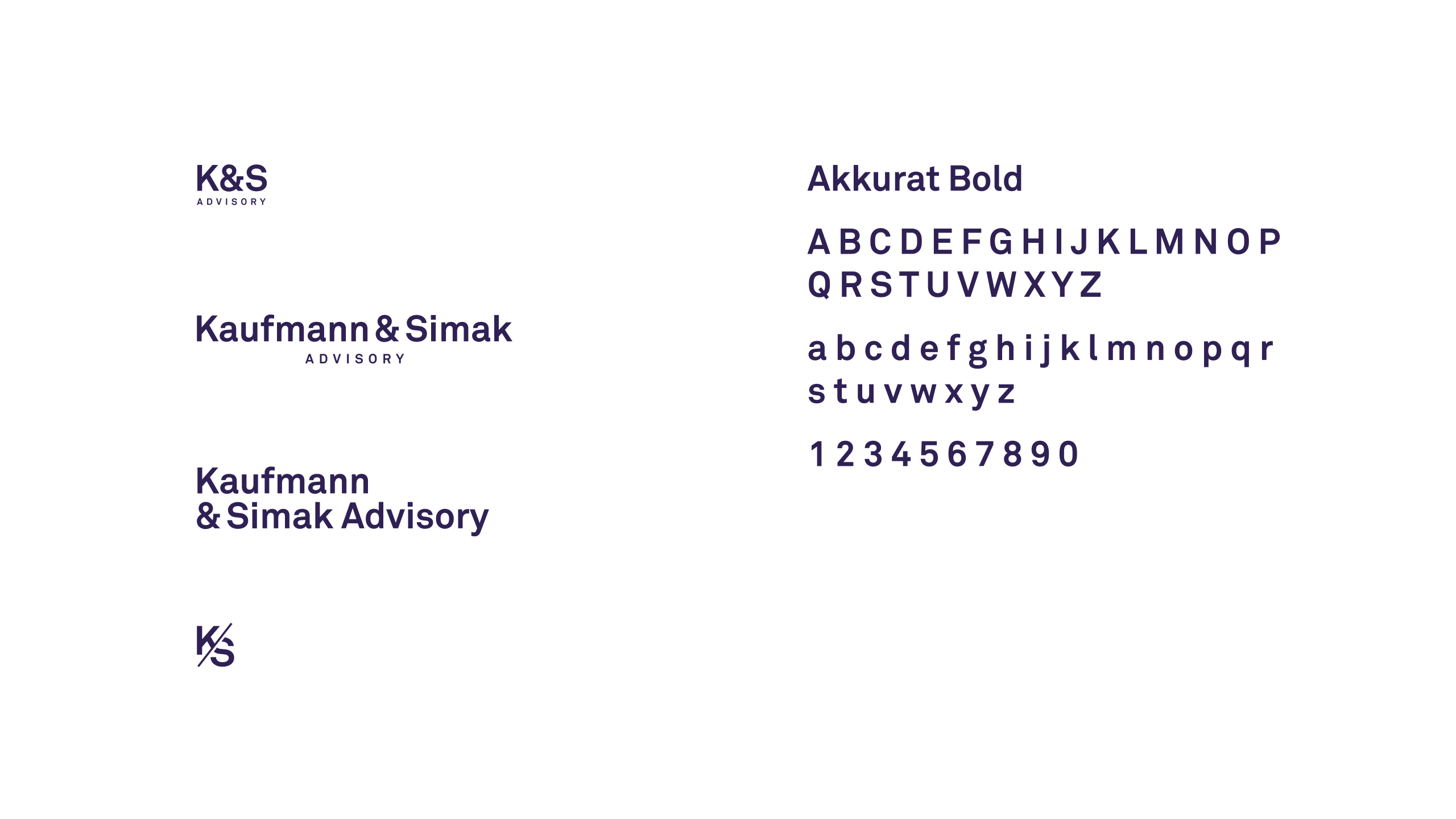
Visual style for HR consultants. The typographic logo has both a reduced version and a full version. The concept of using the textures of different stones and rocks is based on the metaphor of “human resources” as noble minerals that can be mined, and whose physical and aesthetic qualities are the basis of emerging buildings, cultural communities and production processes. Colours are chosen to enable the visual identity to be enlivened and developed while maintaining an internal logic and a serious and sophisticated tone.
