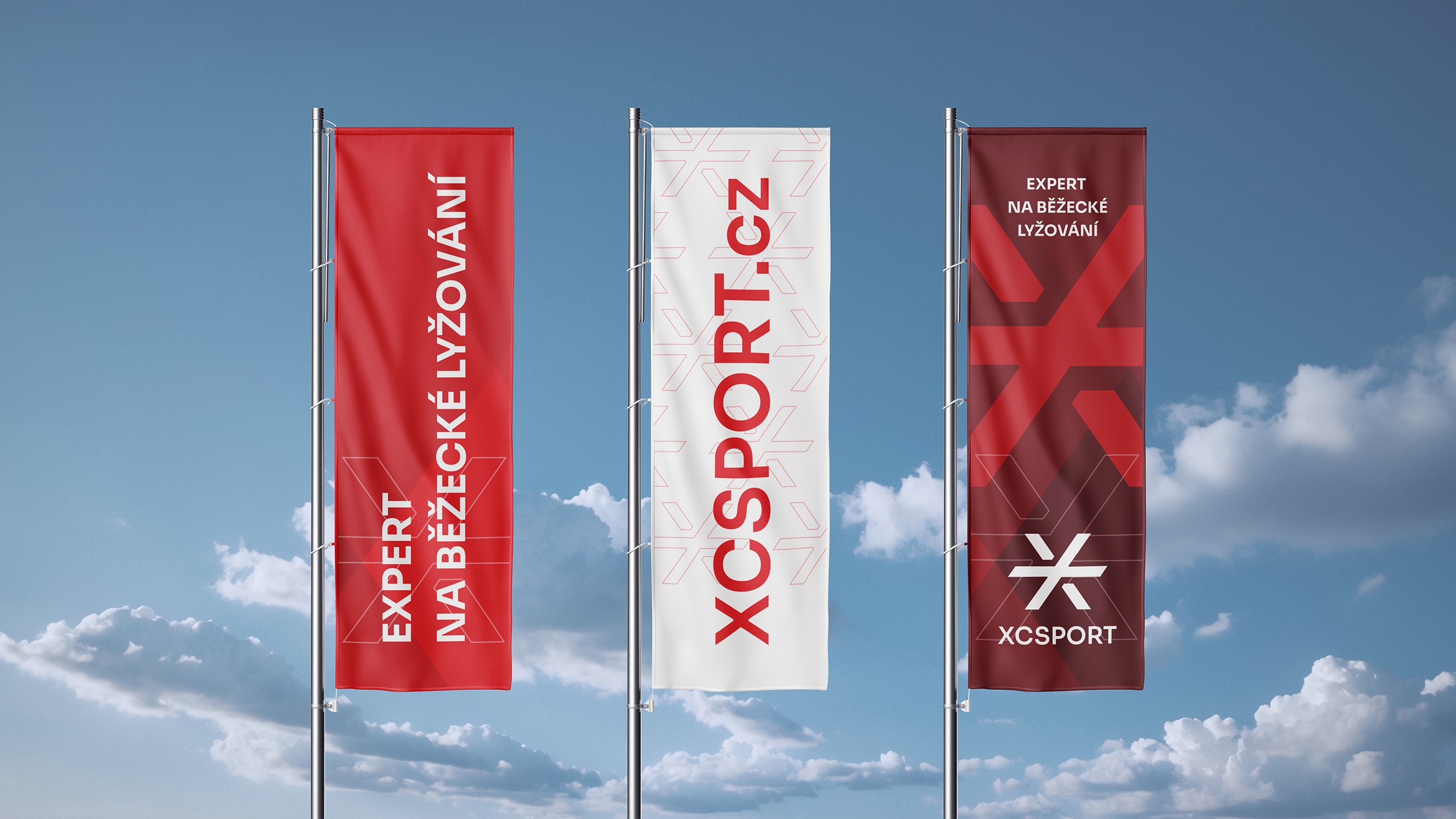
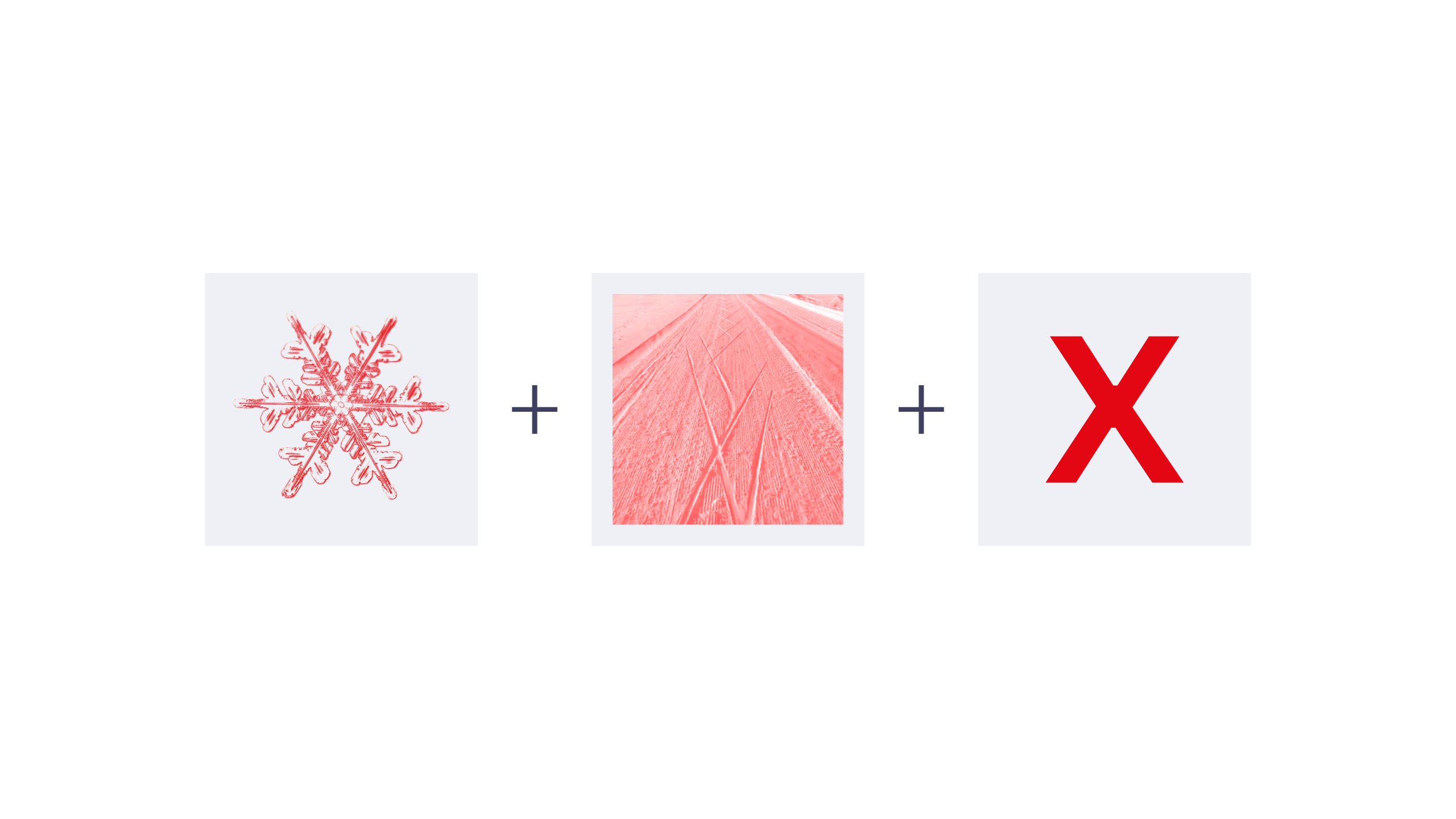
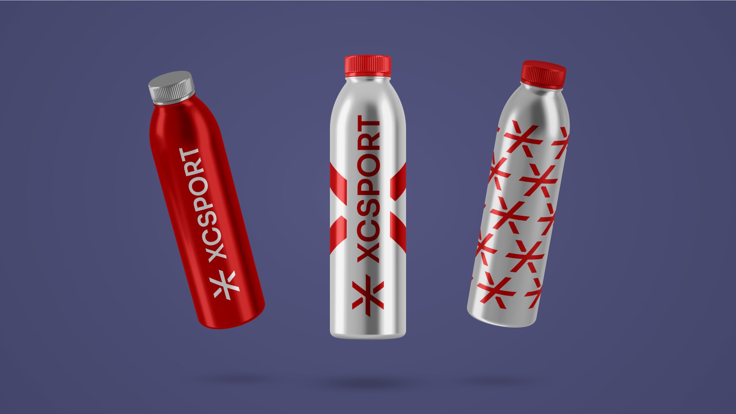
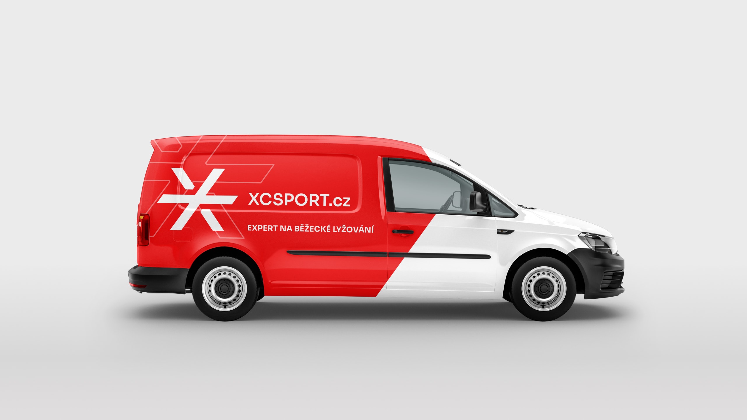
Red in a positive sense symbolizes the color of life energy or adrenaline. For an online shop specialising in cross-country skiing, it was an obvious choice. The logo symbol thus evokes a snowflake, the crossed ski tracks in the snow, and the letter X, which refers to “cross country”. This graphic element is central to the visual style, it ensures that the brand is recognisable in all applications, and the entire complementary visual identity is based on it.
